
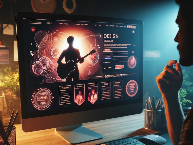
Musicians are deeply dependent upon the talents of graphic designers to create posters, logos, websites, and more. However, graphic designers all too often fall into common traps that render their designs nonsensical or unintentionally amateurish or comic in appearance. Here are some tips to help avoid these pitfalls!
Musical Clichés
One common issue in musical graphic design is that designers immediately reach for the same clichés. The most common of these is the treble clef, pictured here:

It’s difficult to create a striking and original design starting with the treble clef because it’s so overused. These symbols are also commonly overused, though not to the same extent. (The pairs of 8th or 16th notes often also appear without the staff; the staff is the five-parallel-horizontal-lines symbol you’ll see below)
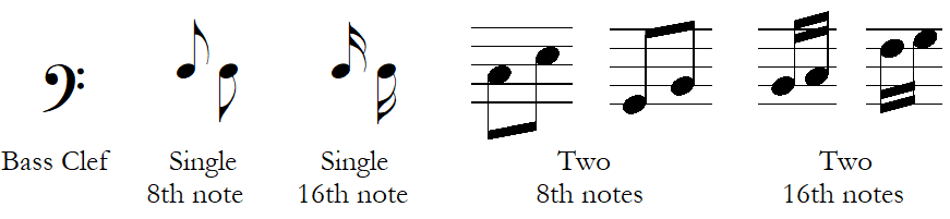
Other common clichés include something with a musical staff (sometimes with the wrong number of lines; there should be five) or piano keys.
You shouldn’t feel like you need to avoid these symbols, but as with all clichés, it can take a little extra work to make them compelling. For instance, consider this beautiful design by Catherine Headen for composer Oliver Caplan, that combines his initials with common musical notation:
![]()
Note Anatomy
If you’re going to use notes in your design, it’s helpful to know a little note anatomy to avoid common errors.
A note head is an oval shape that specifies the pitch (how high or low the note is). It can be open (not filled in) or closed (filled in). It can stand alone (whole note) or have a stem (straight line) extending from the side of it. The stem is placed going up on the right for lower notes and going down on the left for higher notes. Notes can be further altered by the addition of one of more flags. A flag always goes on the right side of the stem. Notes may also be joined by beams. To help us measure how high or low a note is, they’re usually placed on a five line staff. Note heads can be positioned on a line or on a space between lines. If a note is positioned above or below the staff, it may have temporary extensions of the staff called ledger lines.
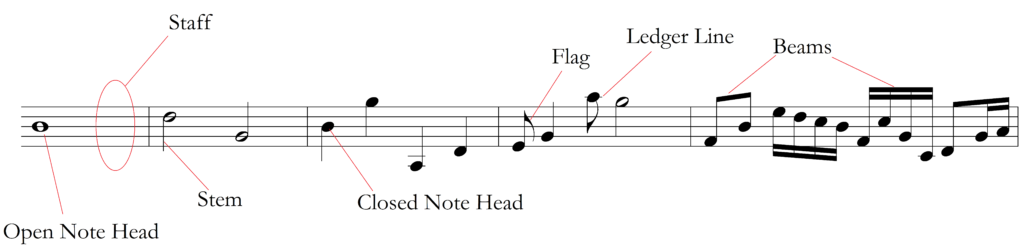
A few guidelines can help. While there are exceptions to these rules, they’re good general guidelines for designers who don’t read music.
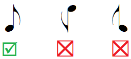
- If the note head is open, it can have a stem or no stem. It cannot have flags or beams.
- If the note head is closed, it must have a stem. It can have flags or no flags.
- Stems can go up on the right side of the note head or down on the left side of the note head. All else being equal, if the note is on or above the middle line, put the stem down; if the note is below the middle line, put the stem going up. (With beamed notes, use the direction you would use for the note furthest from the middle line.)
- Flags must always be placed to right of the stem.
- One or more beams may connect notes (closed note heads only)
Using Musical Excerpts
To avoid notational errors and use something that looks like real printed music, some graphic designers turn to actual printed music. If you’re going to use a musical excerpt, be sure that it’s relevant to what you want to capture. Musicians who see notated music will often play it (in their heads or on their instruments). Making a poor choice of musical excerpt can lead to some embarrassing results, such as this one (documented, among other places, in this article):
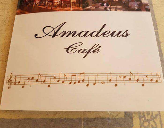
The Amadeus Café probably wanted to use one of Mozart’s melodies. This is actually the melody for the theme song for The Flintstones. This may have been an intentional joke, but quite often, it’s just a badly chosen excerpt. (Fun side note: Edgar Wright Pope noted on facebook that the theme is very similar to this moment from Beethoven.)
If you need a real musical excerpt from a public domain piece, try IMSLP. Note that IMSLP has both scans of hand-written scores from the composer and scans of published, printed sheet music. You’ll usually use the latter unless you’re looking for that hand-notated, belongs-in-a-museum look.
Don’t Flip, Rotate, or Reverse Images
One of the most common design mistakes is to flip, rotate, or reverse images, rendering them nonsensical. Do not flip or reverse any musical symbols without checking with a professional musician.
Similarly, graphic designers will often reverse an image of a musician to better fit their design. The result looks fine to them, but it reads as amateurish to musicians, to whom it looks like the person is holding their instrument backwards.
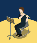
Here’s the flipped version, with the flute held correctly:
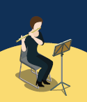
The biggest risk is with instruments that are held to the side (such as the flute, violin, and viola) or point in a particular direction (such as the French horn, guitar, banjo, ukelele, lute, sitar, etc.).
Stock Photography and Images
Stock images can be dangerous when designing for music, because they’re often created my non-musicians. Stock photos are often models posing who don’t actually play the instrument with which they’re pictured. Professional musicians will spot those errors, and it can make the design and the thing being advertised seem amateurish. These stock photographs of the same model looks laughable to a professional musician:
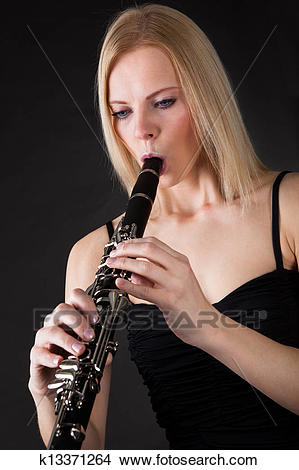
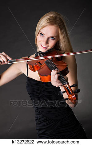
If possible, befriend a professional composer or conductor, as they’re often more aware that most of notational errors and basic errors in how instruments are held, oriented, etc.

Don’t Use the Wrong Instrument
Very often, designers will create a design that they like that uses actual instruments. However, sometimes these instruments don’t match the instruments being played. I once saw a concert for violin and piano where the designer used something like this:
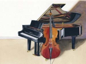
The problem is that that is not a violin; it’s a cello.
Communicating with Musicians
While musicians tend to be strongly opinionated, they can also struggle with visual descriptions. This can be frustrating for designers and musicians, as they have to work through multiple rounds of revisions due to poor initial communication. One way to help break past that is to ask the musicians if they can provide samples of designs they like or that are similar to the aesthetic they’d like for this project.
Comments or Thoughts?
Share your comments or thoughts below! What are some graphic design blunders you’ve seen? What are problems you’ve run into when working with or as a graphic designer on music designs? This post may be updated to reflect your recommendations and thoughts.


0 Comments